THE CLIENT
Honorina Matos is a small business based in Portugal. The brand targets mainly Women and one of their products is a Aloe Vera cream.
THE OBJECTIVE
They had a dated and very odd looking packaging that did not reflect the brand values and needs.
THE SOLUTION
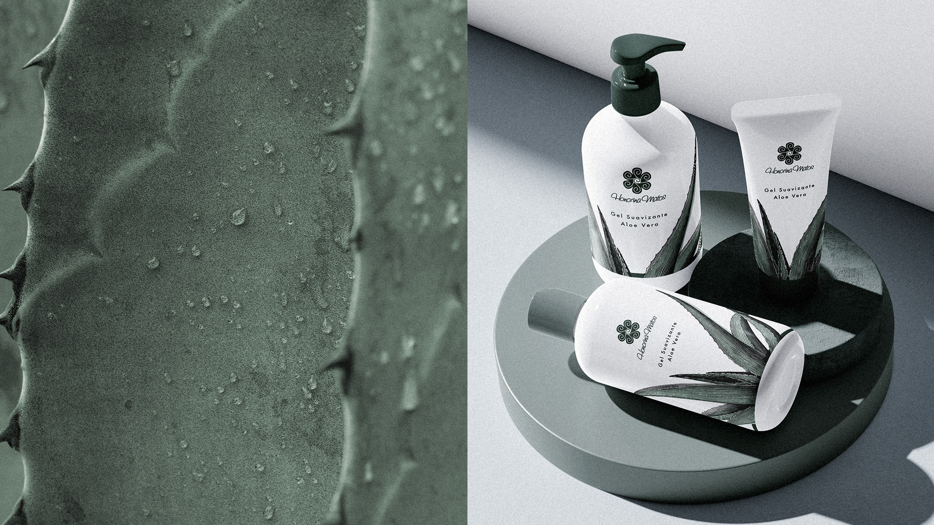
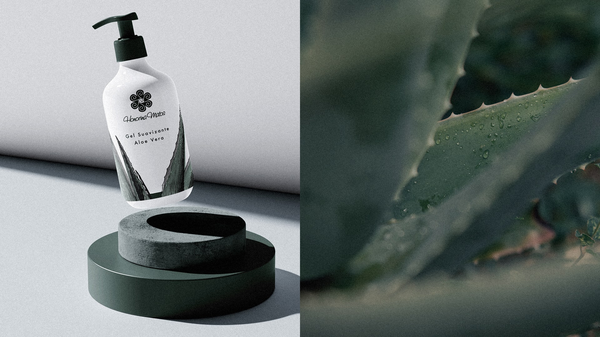
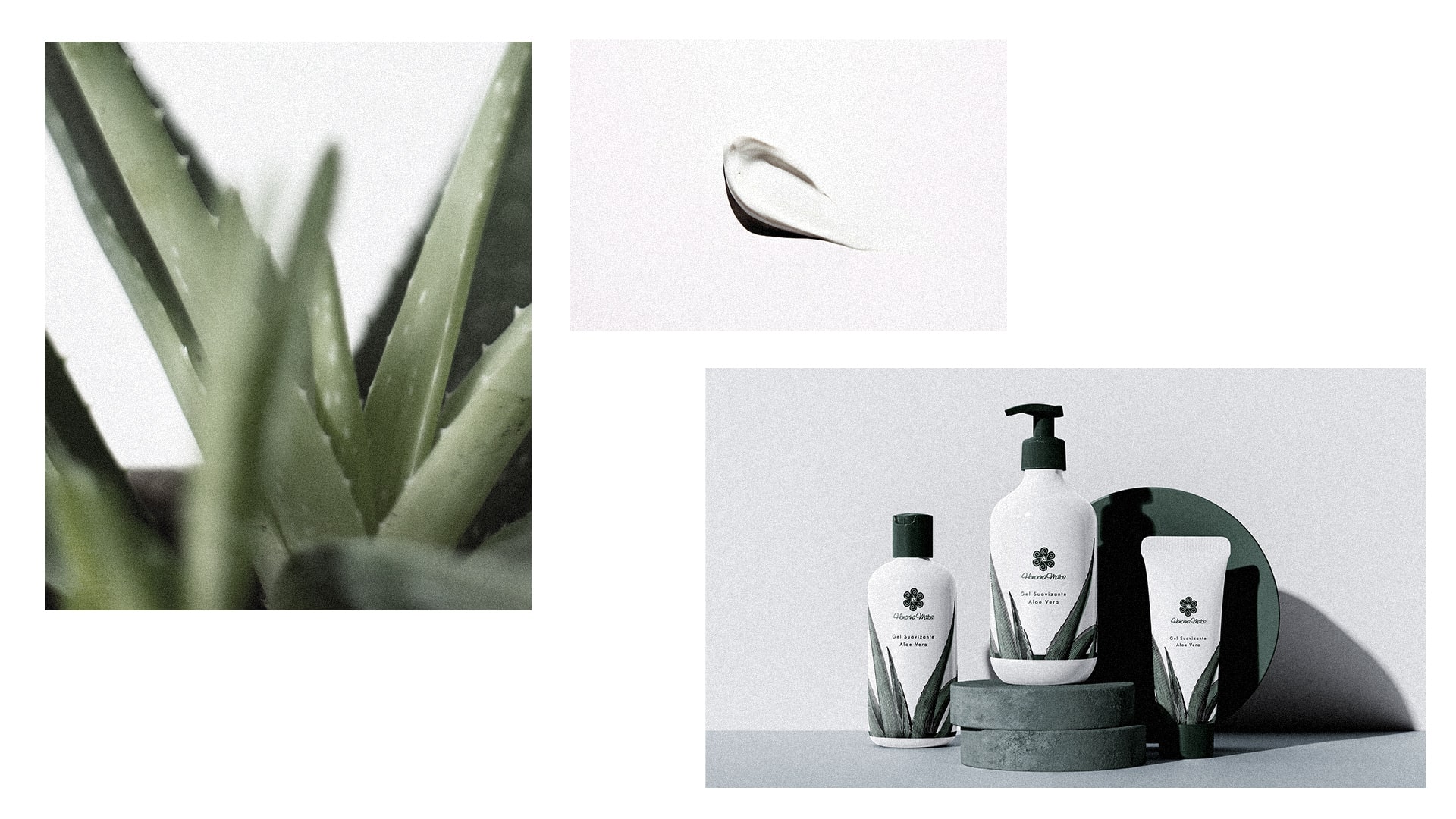
For Honorina, I chose to use green tones and a neutral typography. There was no brand guidelines nor a direction, so I altered the logo colours to fit the needs and opted to use an illustration with some pops of green in it. Thus, we obtained a fresh and more polished look.


